

The colours are the most important content, the soul of photography in Photography. Colours impact photography by 100%. Colours impacts emotions, feelings, and interest of the photographs. In a simple language, colours speak through all the communications of the photograph and convey the interesting message. Let discuss the relationship of the colours with the photographs and how your colours knowledge can boost up the level of photography.
There are two types of colours in photography.
- Warm Colours- Red, yellow, orange
- Cool colours- Green, blue, violet
Warm colours always grab the viewer’s attention, I hope you must have liked the sunset, sunrise photographs. Warm colours are always active and charged and they create a good mood for the viewer. The viewer always feels happy when they are experiencing sunset, sunrise and another warm moment of nature.
Cool colours are more gentle, subdued, fady, neutral, calm etc. Cool colours do not attract viewers’ attention much. Cool colours mostly exist in the background of the photograph. Except for sunrise, sunset. Most of nature, travel photography based on cool colours management. Cool colours also leave a good impression on the viewers because not all the viewers like warm colours. Like in the movie most of the shot was taken into cool colours.
Warm colours attract but, cool colours also create a calm, eye-soothing mood. Warm colours overpower the cool colours that its nature but most of the time photographer play with cool colours techniques.
Emotions of the colours – Important topic to understand.

RED Colours- The most powerful, overpowering, vibrant, active, exciting colour in nature and in the photography. Red gives an emotion of passion, excitement, vibrant, energy, anger etc. Red plays a major role in the photograph if the photographer capture in a correct way.
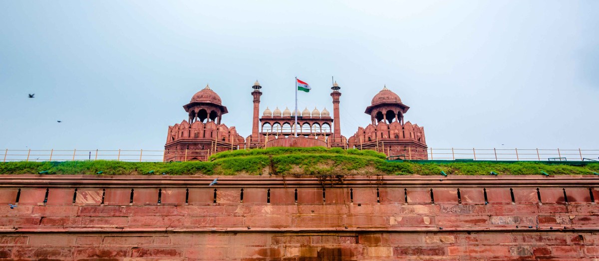
ORANGE Colour– Orange colour is a common colour in nature and appeared in the sunset but also remain constant in nature. The brown colour is the darkest side of the orange colour. It creates a warm feeling and never overpower and give an eye-soothing feeling to the viewer. Also, grab a viewer’s attention. Neither It’s a passive colour nor an active colour. Somewhere in between active and passive colours.
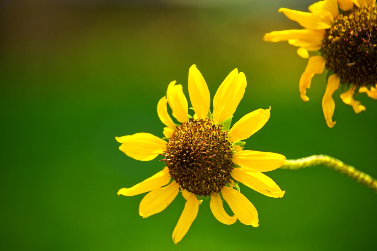
Yellow Colour. The brightest, optimistic, positive, full of eye-soothing, happiest have its own friend following. Not like overpowering and other colours. It is commonly involved in nature along with sunrise, sunset, autumn leaves, autumn grass, sand, etc. Yellow colours always work well in the photographs and give you a sense of positivity. Its always grab a viewer’s attention where ever it exists in the photography.

Green Colour- The most common colour in nature and nature is life. The green colour is a symbol of prosperity, happiness. Our eyes recognise the more shades of green than any colours. Go and see or check the different shade of the green. like deep green, dark green, light green, electric green, bottle green, vivid green etc. This is the only colours having more shades in nature as well in human life. It creates a sense of calmness, gives you peace whenever you are in nature and represents the living world.

Blue Colours– One of the first people to write about the relationship between colour and emotion was Goethe in his 1810 Theory of Colors, in which he said that blue “draws us after it.” The blue colour is directly associated with the real world. Like blue sky, haze on the horizon, This earth is also called a blue island because of the 70% water exist on the earth and it looks blue from the satellite. Blue is a calm colour and grabs the attention of the viewers. I have read somewhere, Blue images get more likes on the Instagram images because of the quicker attention of the viewer. Blue is not busy colours like red and orange and never distract the viewer’s attention. Blue has a different shade of colours like dark blue, light blue. Light blue is positive, subdued, gentle and dark blue is strong sense, create an intuition etc. But both shades are peaceful. The blue colour gives a great balancing in the photograph.

Violet Colour– The rarest colour in nature. Only found in the flowers or sunset. But its commonly appears with blue. It creates a mood of royalty and riches. It’s peaceful and very calm. Photographer feels lucky after the capturing of the violet colours in nature.
In classic colour theory, every cool colour’s complement (opposite) is a warm colour and vice versa. Red and green are complements; so are orange and blue, as well as yellow and violet.
Understanding the colours in photography is like understand the value of food in human life. Colours carry emotions strongly and communicate so well as they interact with viewers. Finally, whatever looks great to your eyes even in post-processing, That is all right to you. the colours you choose that create your personal style. some famous photographers have a “look” to their images that are largely due to their colour palette. So, once you understand the fundamentals of colour, it’s best to take this information and make it your own.
Keep experimenting and have happy photography to you
Photographer and Blogger Prasenjeet Gautam (www.prasenjeetgautam.com) has captured above all the images.

Hi friend, love the photos and the information provided. You’re provided a great learning experience for so many.
LikeLiked by 1 person
Thanks, my friend.
Sharing knowledge is a wonderful thing. We all must share that what we know and can be beneficial for the world.
Regards
LikeLiked by 1 person
You are making a contribution and I know your followers appreciate all you have taught them. Have a great day.
LikeLike
Reblogged this on For the Love of Art.
LikeLike